The Problem
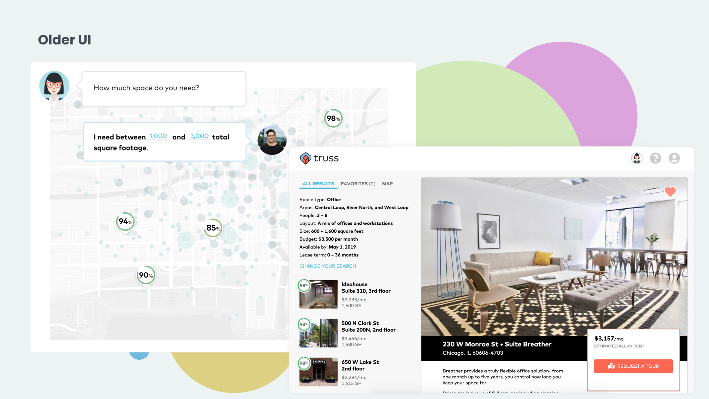
In the early days at Truss the approach to finding the best office space was a heavily AI guided series of hurdles to match tenants with their best fit spaces. The goal was to eliminate the amount of time a prospective tenant would spend looking through spaces that may not be perfect for them.
A large part of why the guided experience was necessary had to do the growing database of office spaces. When we started, we only had access to a segment of the market so we had to guide the users to the best spaces we had available.
We couldn't simply handle an open address search resulting in missing spaces.
Over time the database had matured as several partnerships were formed and API's were pipelined into the system. It was time for a change.
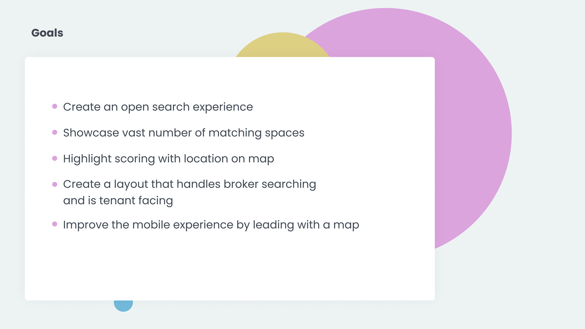
My Role
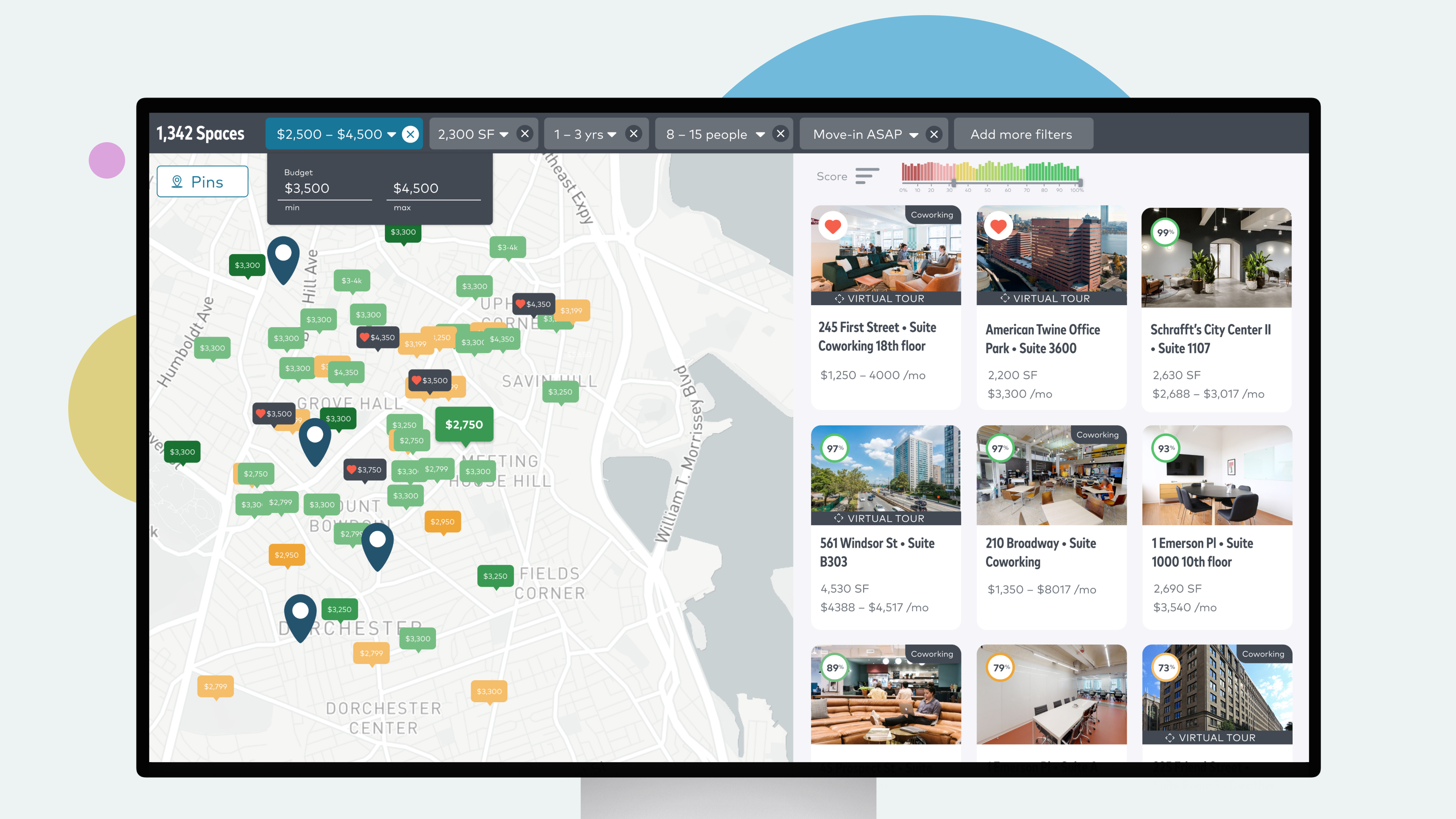
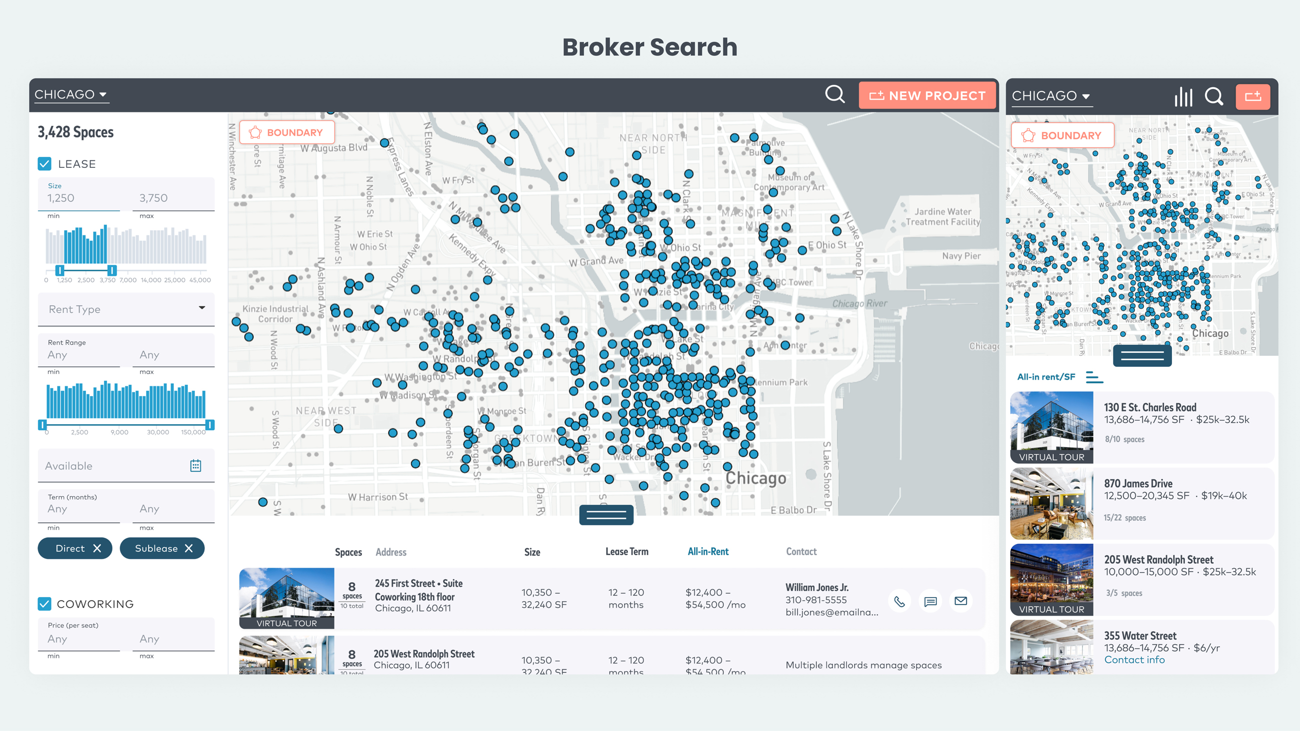
As the lead product designer at Truss it was my job to create a familiar UX for prospective tenants now that our data could handle an open search. One of my first goals was to showcase the vast number of spaces that we have available.
Research
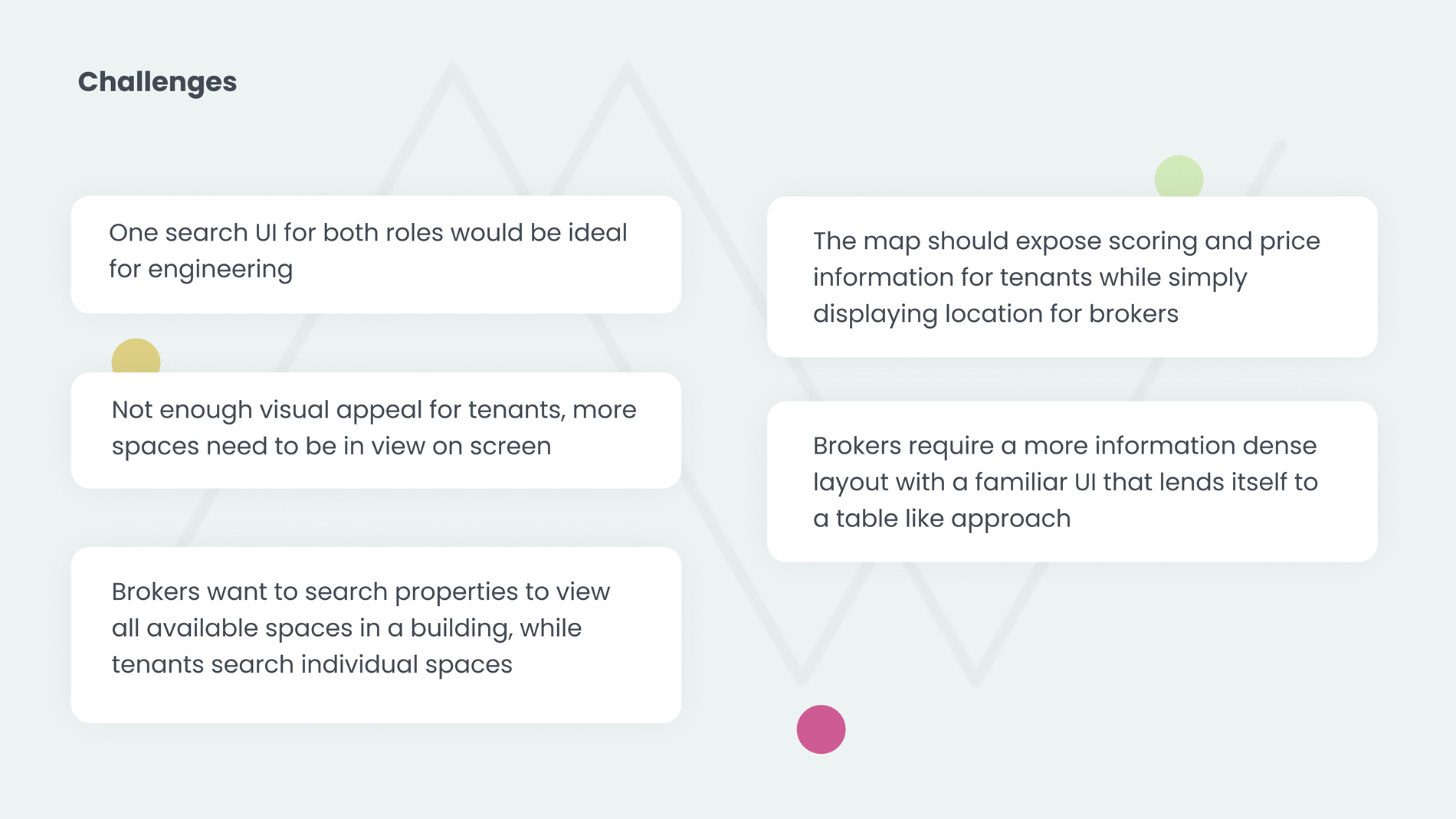
This should be easy to use in the way that many search for apartments, vacations, and cars. Users are accustomed to narrowing their own view, most like the freedom to set their own parameters.
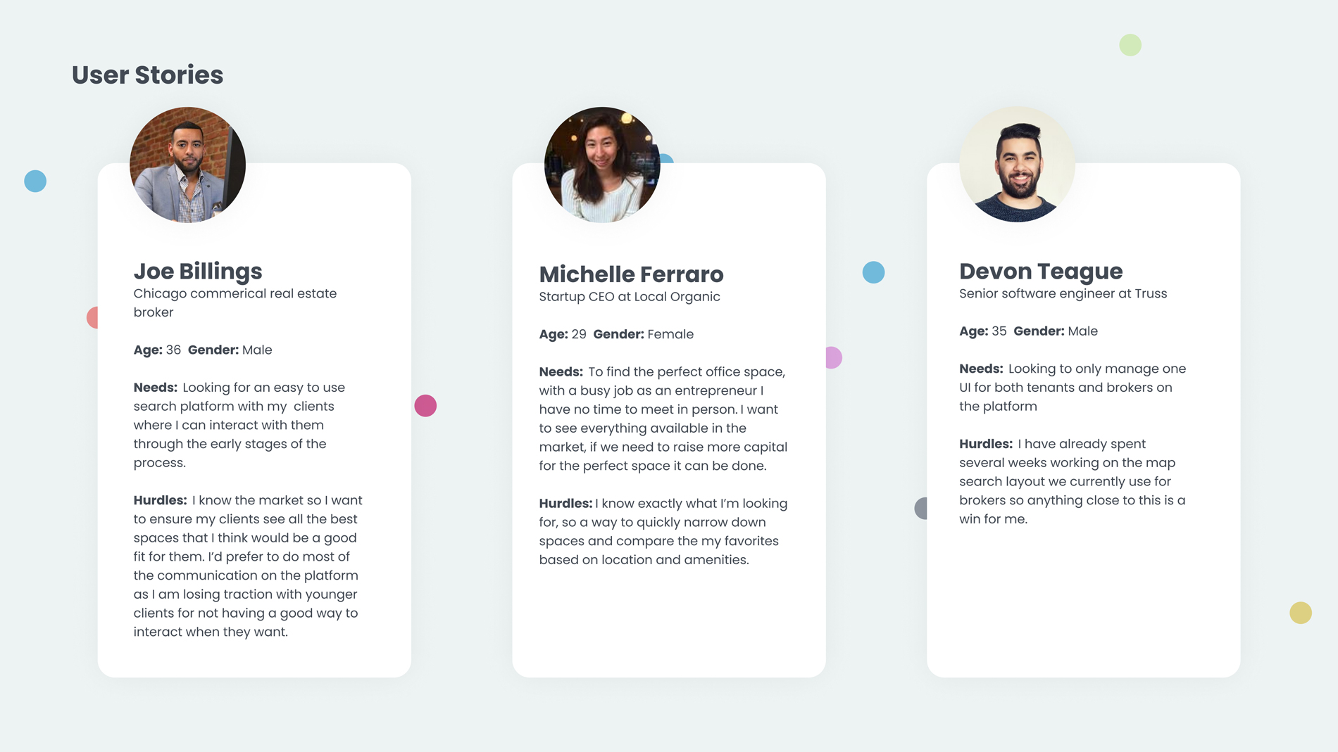
The tradeoffs were personal, some tenants might be willing to move to a completely different neighborhood if it means they could have the office of their dreams. Some might find the amenities of coworking interesting and more beneficial than having their own floor in an older building.
The Solution
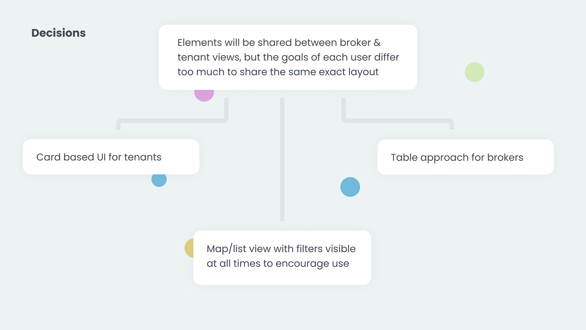
Build an interface that displays a whole market view to encourage users to filter their own results. Make the design flexible enough to accommodate the broker audience as well. This allows developers to use a similar coded approach to searching & interactivity within the UI.
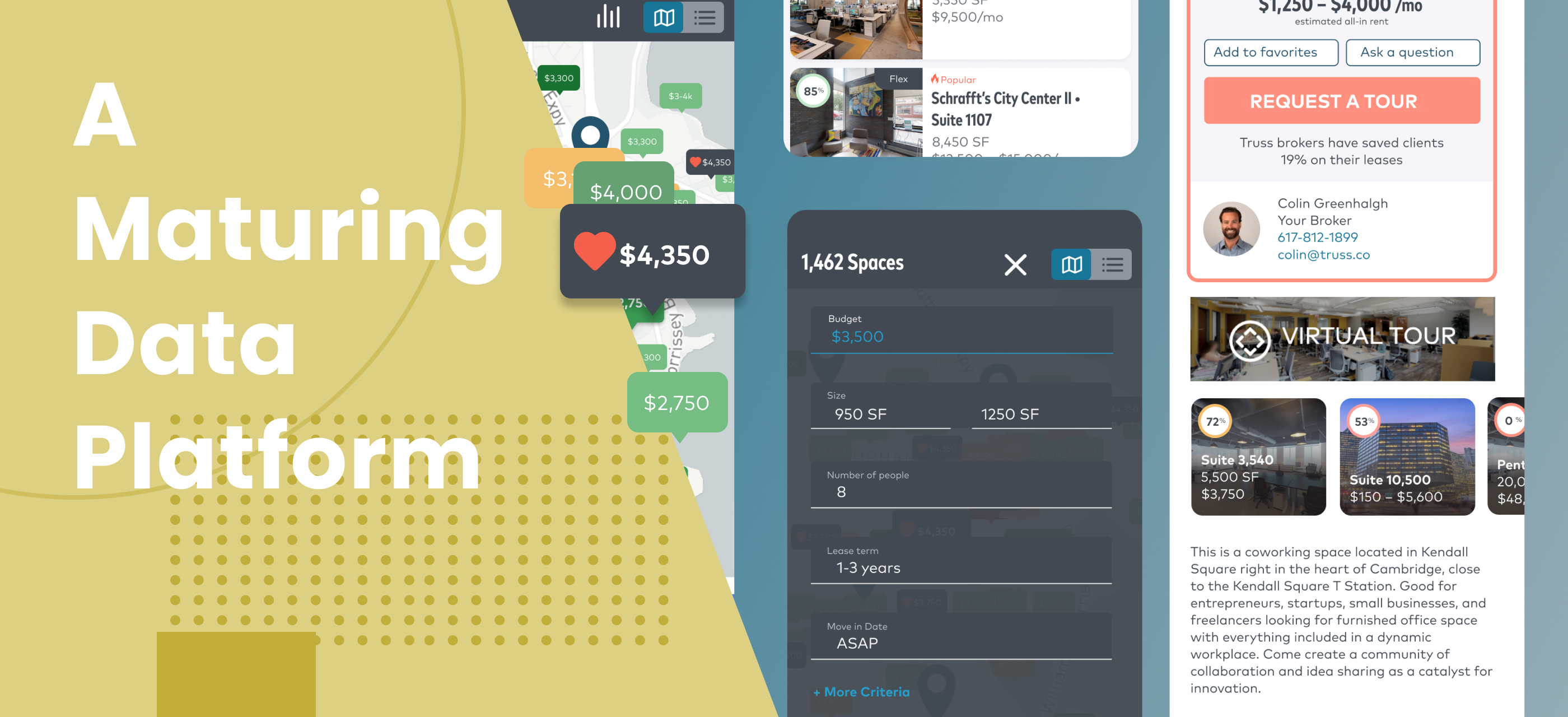
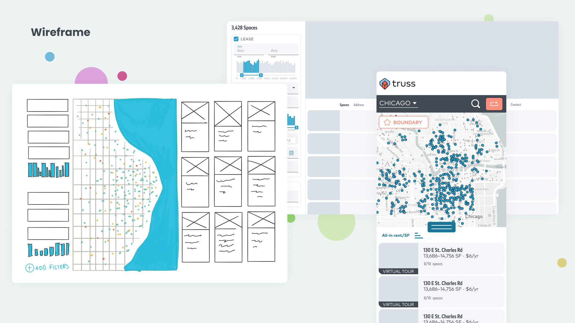
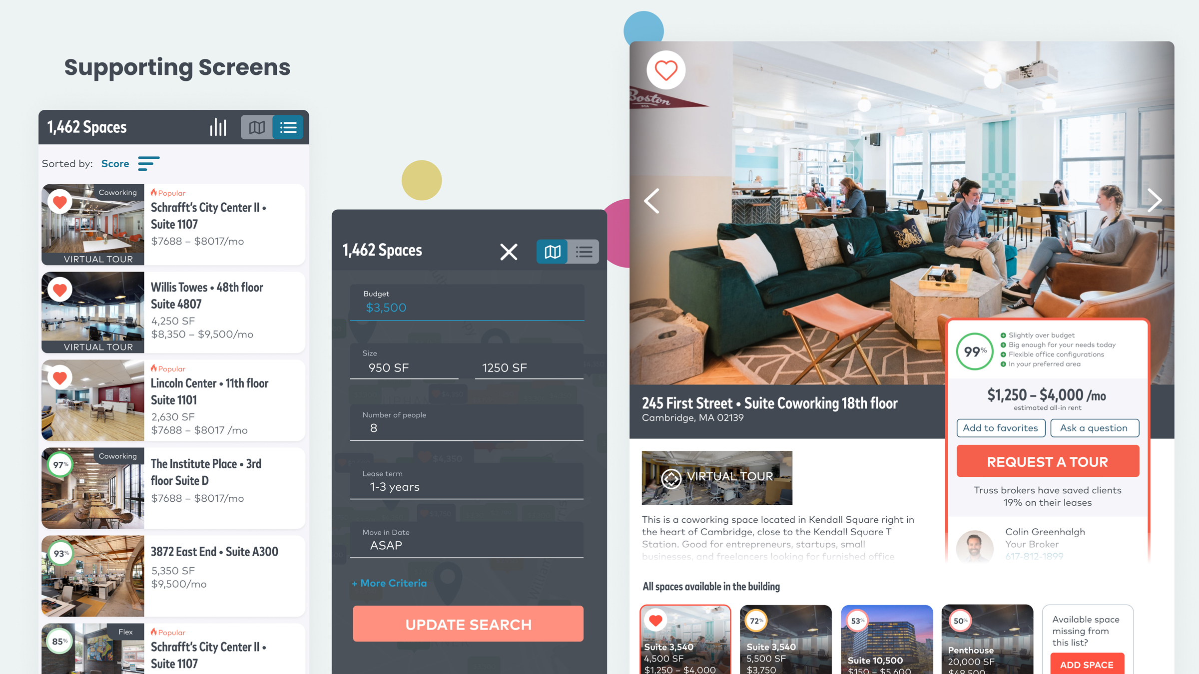
Mobile UI in Figma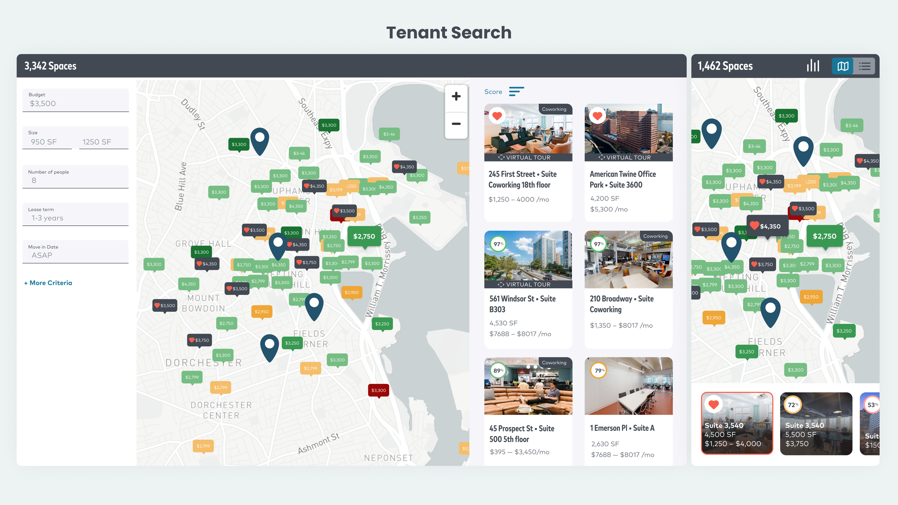
Retrospective
After some user testing I came to the conclusion that users more often then not just use the basic criteria when filtering so I was able to adjust the layout to remove some of the weight to filtering. With that in mind, I bumped the filters to the top toolbar. The experience is just a better use of screen real estate and more usable overall.