Meaningful Interactions to Gain Sponsorship
My Role
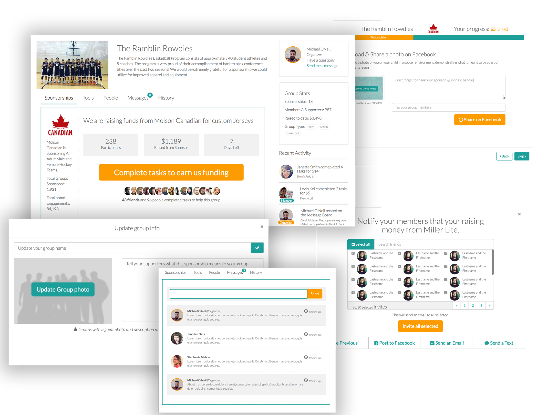
I was tasked with conceptualizing and re-creating fundraising pages for groups on pearup.com. My charge was to take a group page from a seven-day fundraising event and convert the page to a group hub, where members and supporters can interact with the site indefinitely.
“Once a seven-day sponsorship is complete, the fundraising page becomes inactive, with no functionality.”
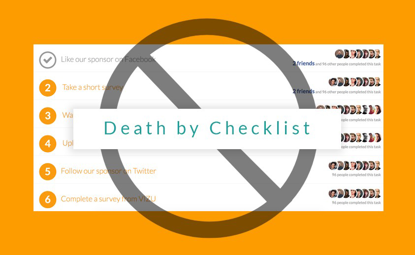
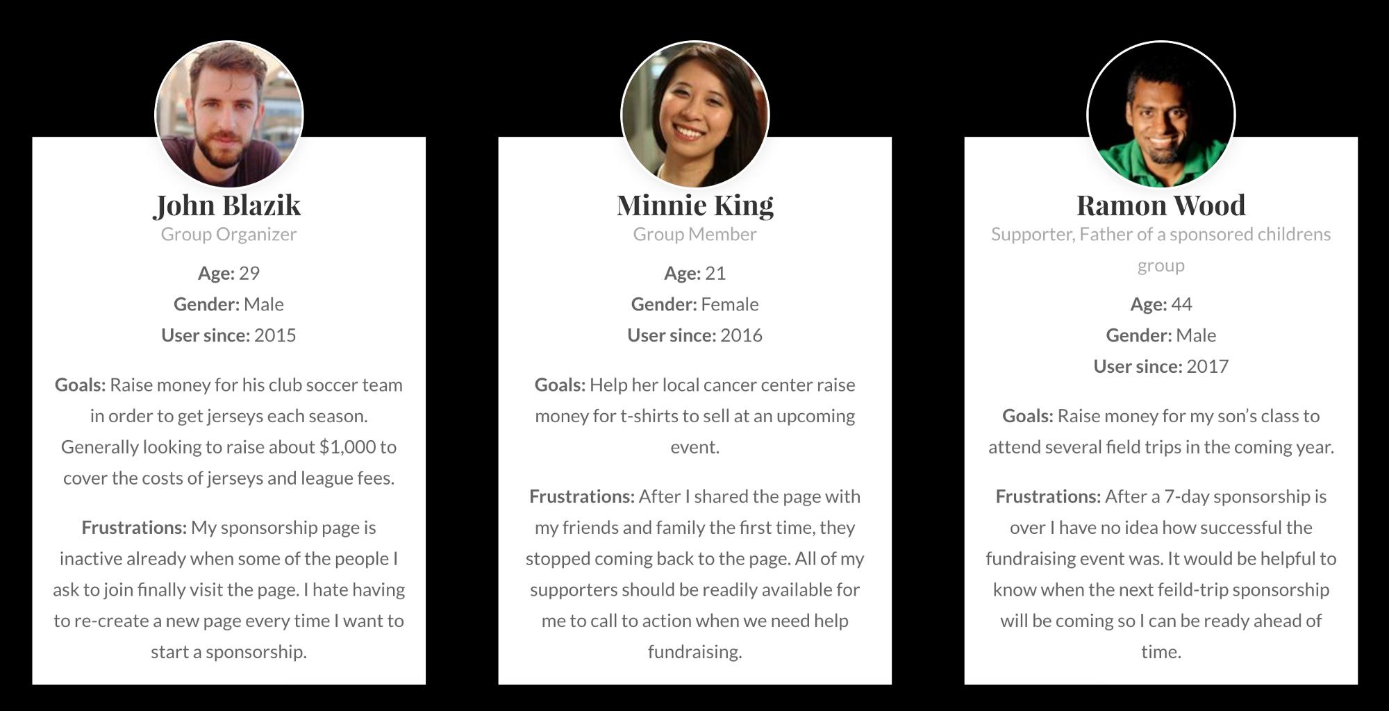
Group leaders of pearup.com fundraising pages were reaching out to customer support at Pear, hoping to re-use a past fundraising page as opposed to creating a new page. (Think of re-activating the same GoFundMe page every time a new season comes and your team/group needs to raise funds). Unique links for group fundraising pages (i.e. pearup.com/brooklynbuckets) can only be used once; forcing users/groups to use less desirable or obvious links to their page (pearup.com/brooklynbuckets56342). If funds are not raised with-in the seven-day time frame, users/groups end up with multiple fundraising pages. This causes confusion when members search for their group pages to join and supporters try to contribute to a group. This also leaves part of the sponsorships on the table, as some of the awards or funds are only able to be used once per group or have minimum order requirements (i.e. minimum 20 shirts per order and one group of 25 has earned two $200 certificates for t-shirts).
It was time for a change.
User Personas
Brainstorming
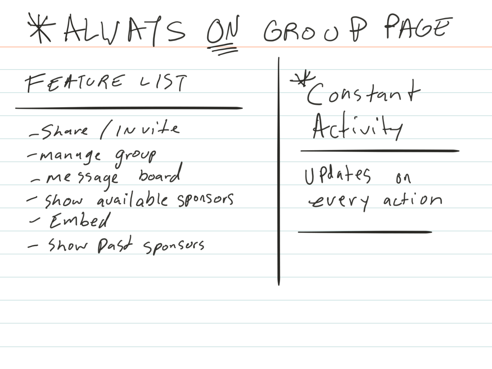
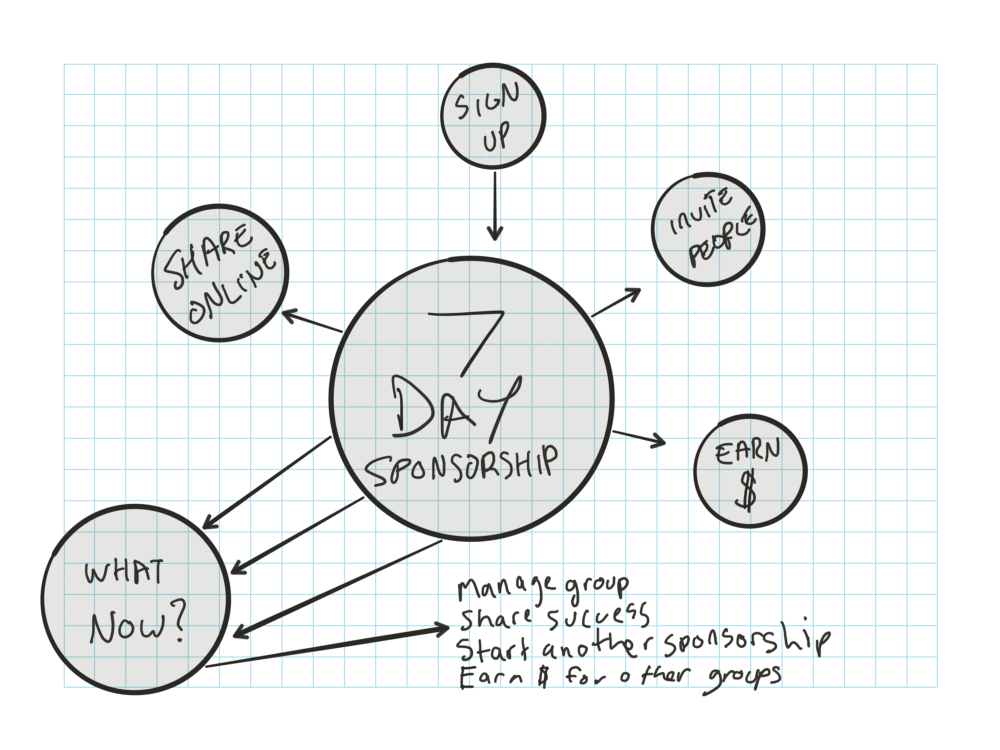
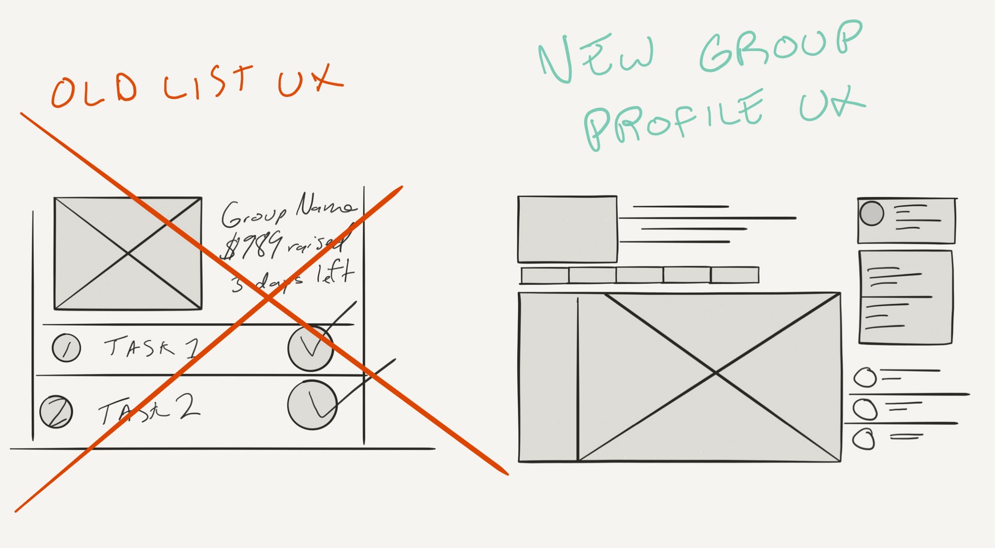
The previous UX was a checklist based layout, once tasks were completed the page simply showed an end state. With the new Group profile layout the tasks can live within a tab allowing us to highlight another feature or start another fundraiser once the tasks have been completed. Thus allowing group pages to live on forever.
Wireframes
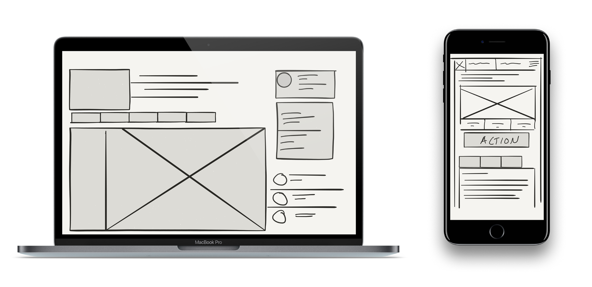
In order to have a multifunctional page we used React to develop a state based set of views for the new group page. You can begin a fundraiser, build out your group, message your group, as well as adding group information such as upcoming schedules/calendars.
Design & Prototype
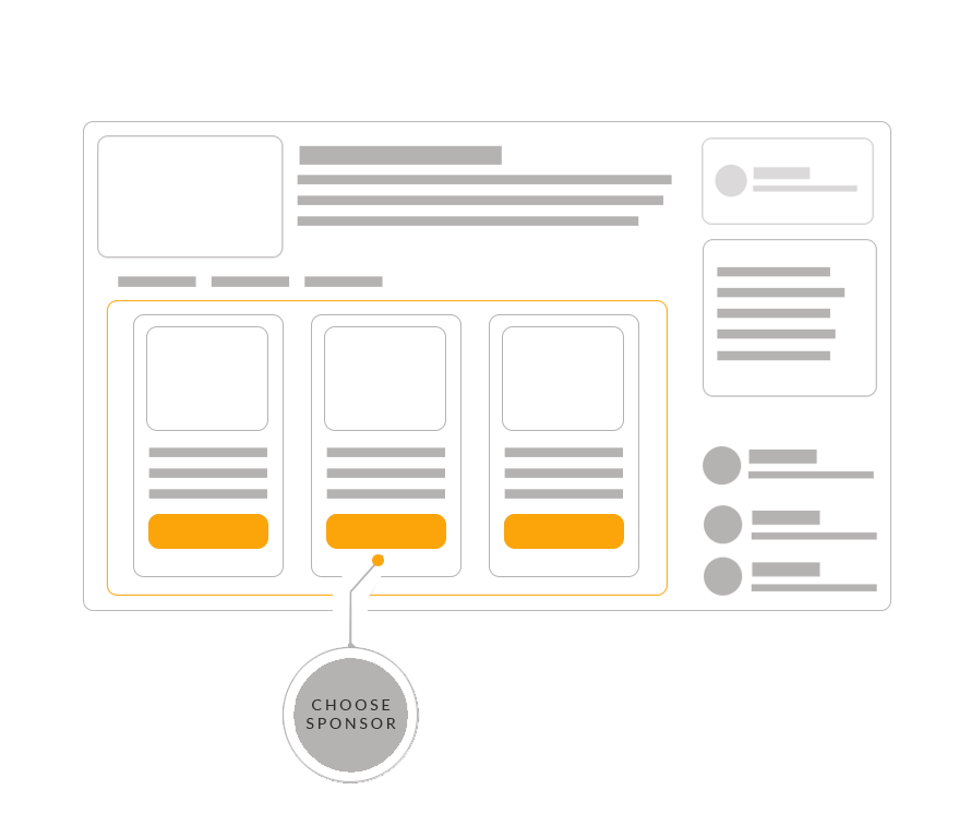
Finally we came to a super simple design allowing the content to be the main focus while using accent colors to highlight functionality. Pretty similar to the wireframes actually.
